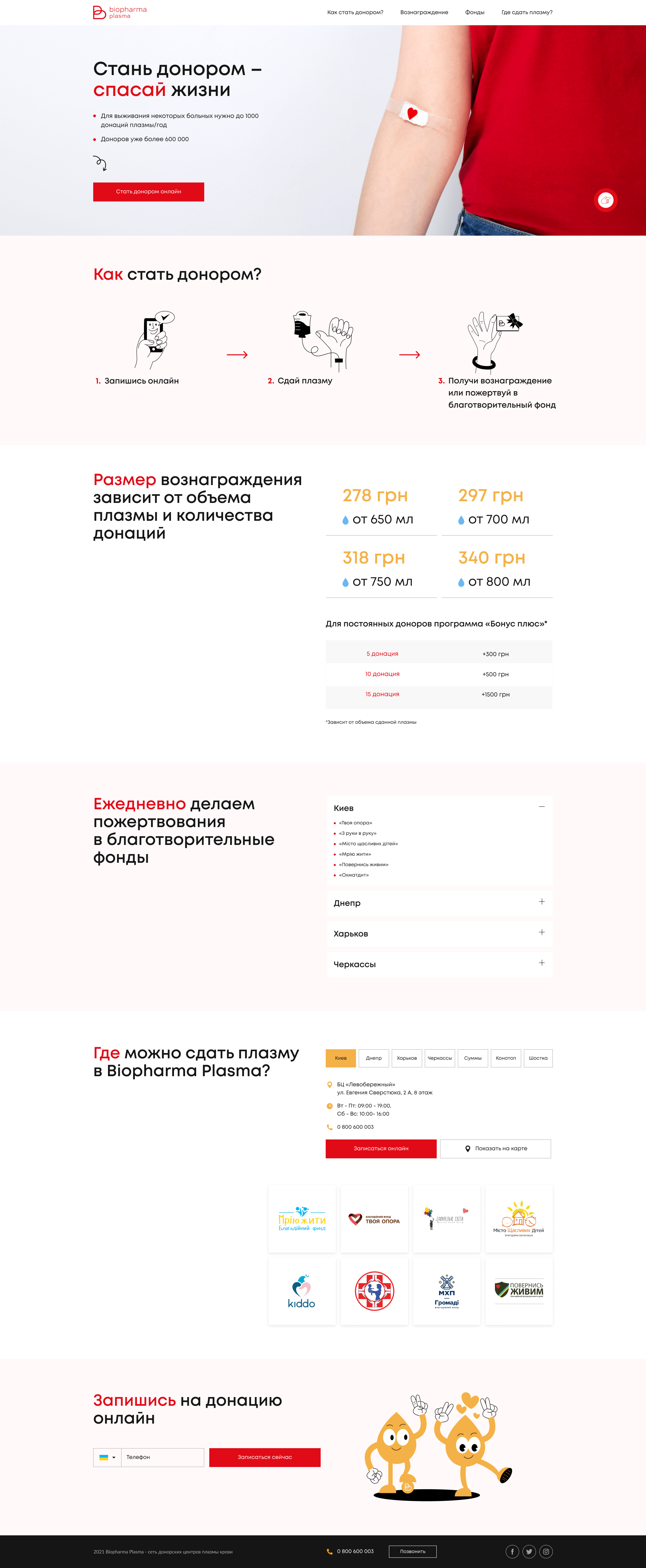
Task: to develop a corporate website which main purpose will be to promote the donation and bring all the benefits to future donors, as well as automate the registration process.
Solution: Our team created a unique to this niche design for a corporate website.
As a result, the company has received a functional tool for solving many business problems, which not only performs information and brand functions, but also helps to collect applications for registration from donors from across the country.
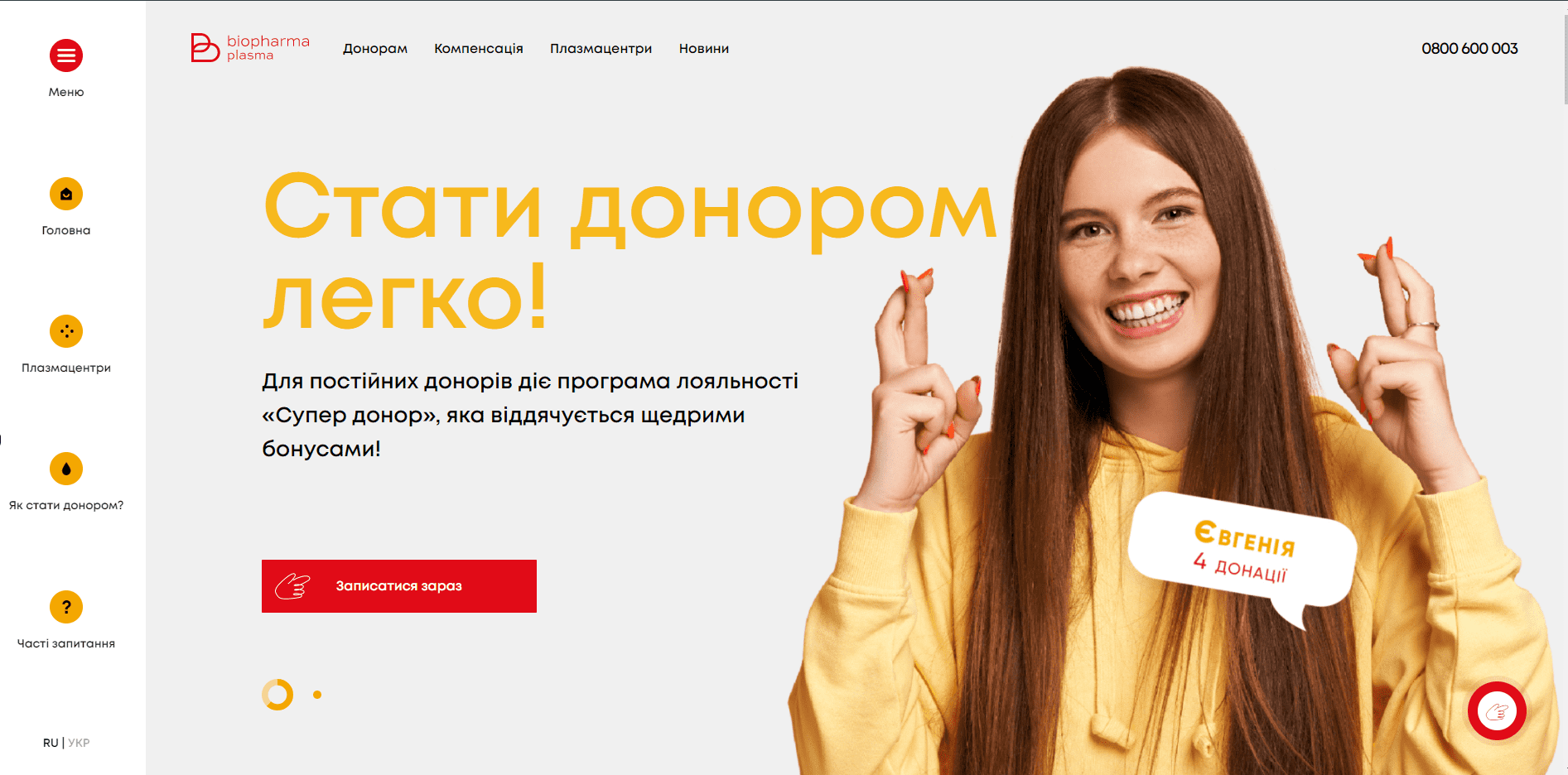
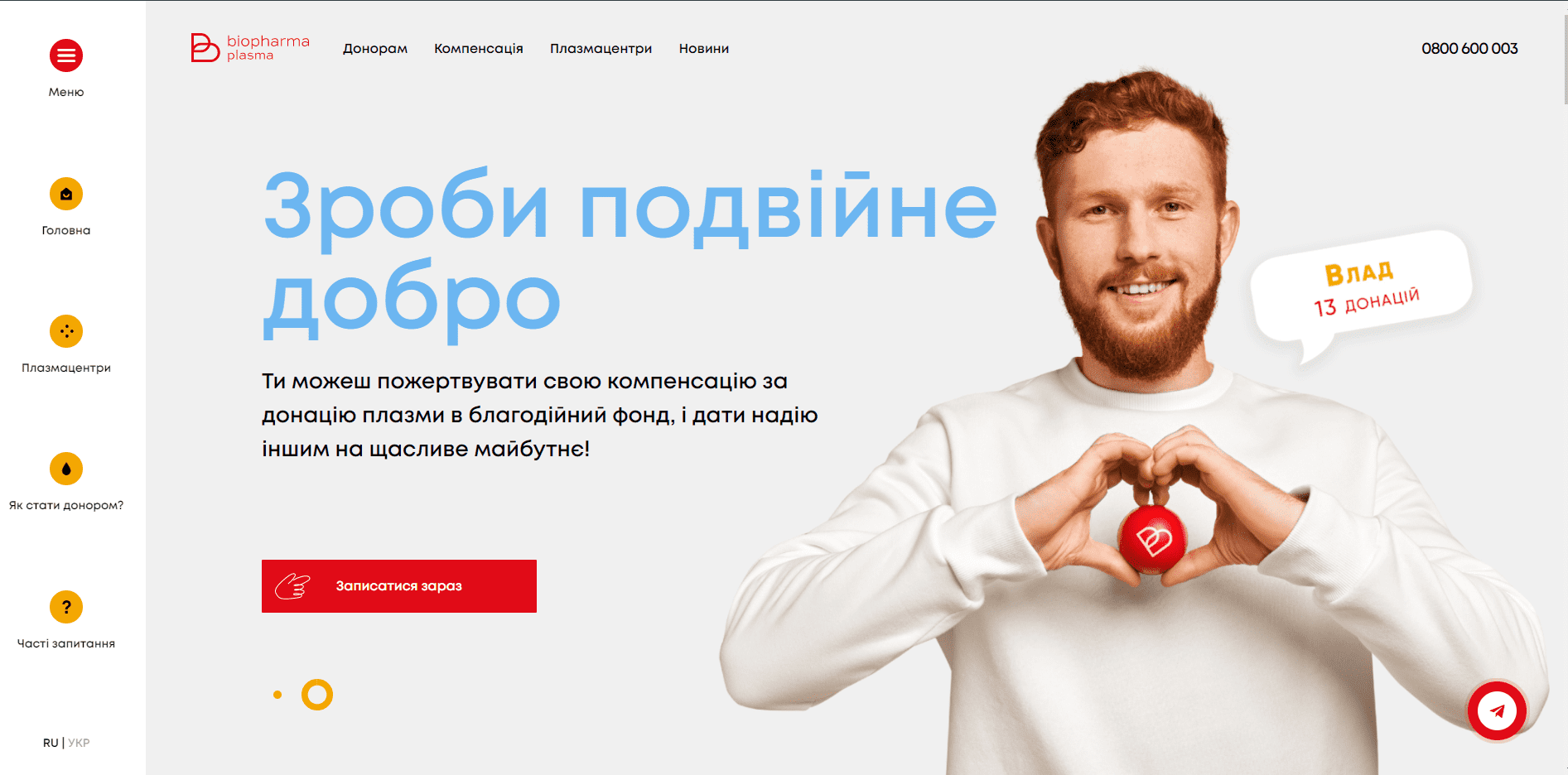
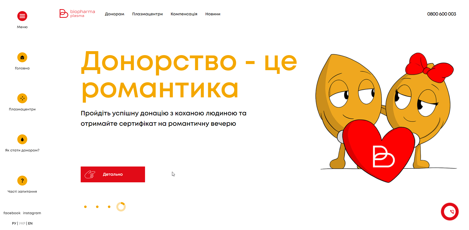
20 types of pages, 50 types of blocks and 3 unique landings were designed for this site.
With our long read pages constructor technology, 75+ unique information pages and landings have been created from these fifty blocks, which can be displayed in any number and sequence. No programming skills are required to design or administer pages.
A unique system has been created, the transition between information blocks, which are not presented in the form of large text pages, but as small blocks, comfortable to perceive. The conversion system consists of stylized links, and encourages the user to continue to navigate between pages and read information on the site.
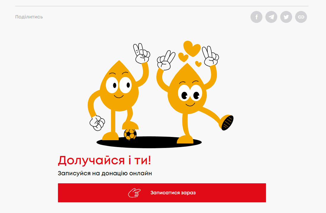
The client's wish was to create a site with a style unusual for serious companies. All UI design, created in a modern bright style and at the same time transmits the company's philosophy and successfully distinguishes it from competitors.
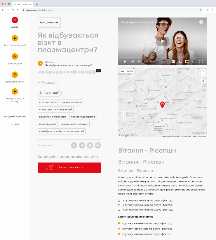
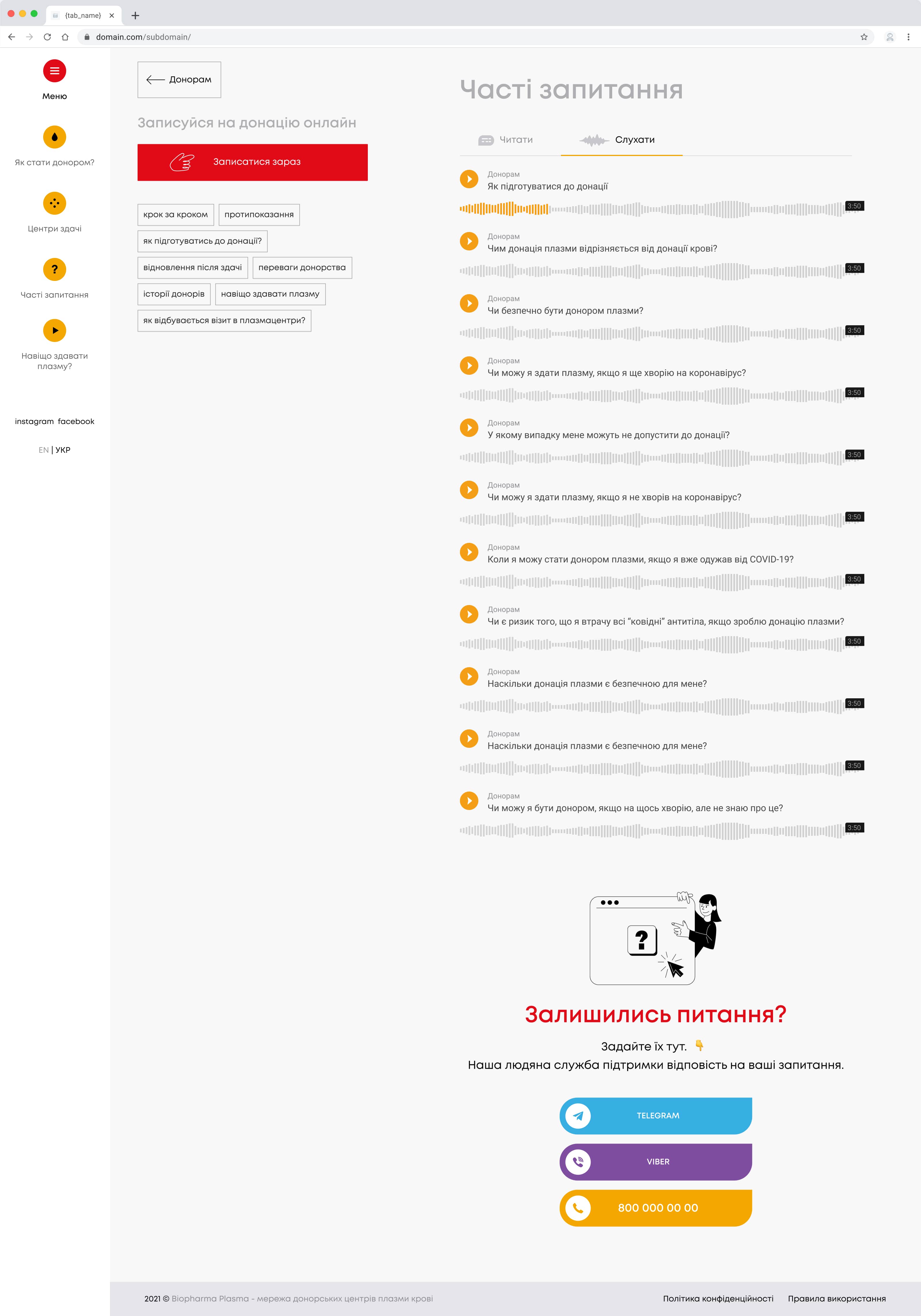
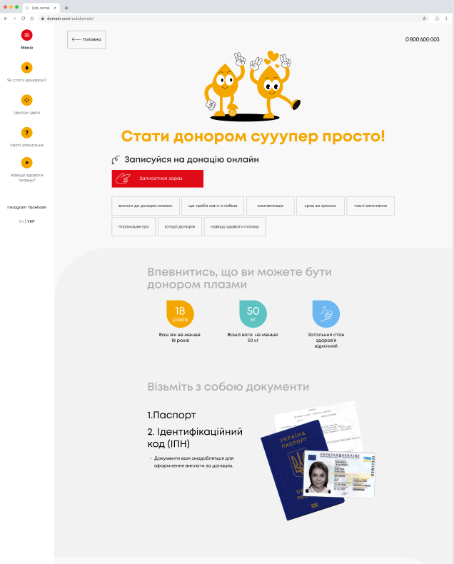
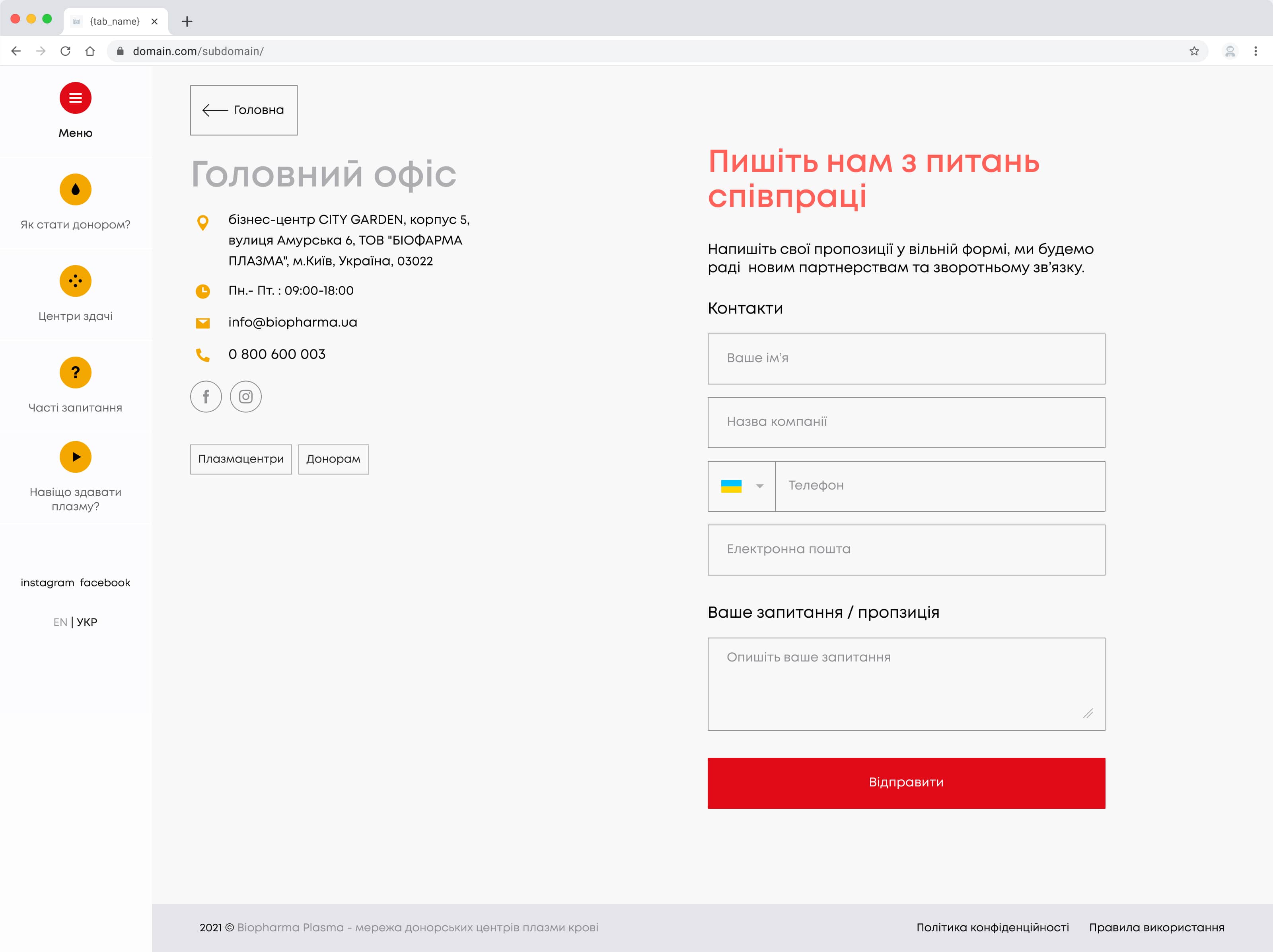
In addition to the fact that the site performs an informational function, it is a convenient tool for systematizing the record of donors from different cities of Ukraine.
Initially, in the MVP product, the entry form was on EasyWeek, which was an intermediate stage for this project.
Especially for this project, we have developed a much more convenient form of recording, which receives free slots for recording and sends the recording to the CRM system.
The system unites all donor centers of the company. The user can easily sign up for a donation by choosing the most convenient center and leaving a request.
An automated questionnaire system was developed to save visitors' time. The registered user receives a link to fill out a questionnaire on Viber, 30 minutes before the visit. After completing this questionnaire, it automatically enters the system of the center. So during the visit a donor no longer needs to spend time on the survey.
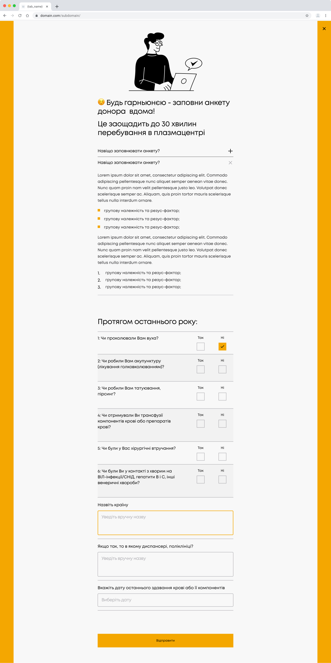
- The third quarter of 2021 automated the donation record
- Fourth quarter 2021 - developed a questionnaire system
- First quarter of 2022 - developed 5+ landings and improved site performance.
At the moment, the project continues to develop.
